Introduction
I'm a teaching assistant for several MSc courses, covering natural language processing, natural language understanding, information retrieval and Python programming. Students on these courses, as part of their coursework, often have to produce visualisations of data. Usually, for these types of questions, the format of the visualisation is made clear.
For more open-ended tasks where students are free to follow their own processes, however, I find that students often make visualisation choices which impede the reader's ability to quickly reach the conclusion they are trying to illustrate. This is usually due to one, or more, of several reasons.
In this blog post, I'll first lay out what sort of questions you need to ask yourself before you start plotting. These questions are all based on understanding what data you have and what you want to achieve. Then, I'll give examples of how you could proceed, in a variety of simple situations, and produce plots that show what you want.
The focus will be on the intended purpose of your plots and the kind of data you have, though I'll also point out some things you want to consider such as other distinctions in your data that you want to illustrate, as well as general tips for aiding the reader in accessing and understanding your plots.
Requirements
- Python 3
- pandas
- seaborn 0.9
What's the purpose of the visualisation?
- Do you want to...
- show the relationship between variables?
- illustrate individual distributions of variables?
Student don't always pick the best visualisation for the aspect of the data they want to represent and don't know that their choice of visualisation is highly dependent upon their aims. Do they want to show the relationship between two (or more) variables? Or the distributions of one or more variables? Should the data be aggregated in some way first?
But even before this question can be addressed, students also aren't fully aware of what kind of data they are working with. This is crucial because it helps determine what visualisations are suitable - choosing the wrong one can be jarring when viewed by someone who is better able to make these distinctions.
What kind of variables do you have?
- For each variable...
- Is it continuous?
- Or is it categorical?
Most data falls into one of two categories: continuous or categorical. The distinction between the two can be difficult to make. This distinction isn't usually explicitly pointed out to students - they're expected to know it beforehand. And even when it is, the different kinds of visualisations that are suited to combinations of the two are rarely taught.
Continuous data
Continuous data will consist of variables which are real numbers. They can have any value from an infinitely uncountable selection. These will generally be floats or integers and will have the expected numerical properties associated with the real numbers. Such data can be sensibly ordered from smallest to largest and can undergo basic arithmetic operations. In practice, continuous data will likely be a measurement of something: weight, height, time spans, density, age, volume, distance, speed and so on. It is sensible to think about adding two weights to each other, or subtracting one height from another, or calculating the mean of multiple ages.
There can be some terminological confusion here as continuous data can easily be discrete (e.g. integers).
Categorical data
Categorical data is not real-valued. Instead, the values are more like labels or names. Generally, these will be represented as strings. Examples are the months of the year, names of colours, makes of car, medication names. Although some of these variables can be sensibly ordered, this ordering is not innate. Rather, it is reliant on some other dimension such as time (e.g. the days of the week) or wavelength (e.g. the names of colours).
Confusingly, the names of the categories can be integers or cardinal numbers! For example, if you run several different experiments and record some real-valued outcome for each, then you may label each experiment in the order you performed them - 1st, 2nd, 3rd and so on. Unless there is some dependent factor between experiments, then such labels may obscure the categorical nature of what the variable represents.
As a counterexample, when tracking the loss per epoch when training a model, the epochs will likely be labelled 1st, 2nd, 3rd and so on. The labels of these categorical variables have important temporal ordering and each depends on the prior step. So this would be a discrete continuous variable.
It is important to note that continuous data can often be converted to categorical. For example, ages can be binned into groups labelled "children" and "adults". Making the decision to do this very much depends on the point you wish to illustrate with your data.
Is there some other informative distinction I want to show?
Do my variables come from...
- different groups of people/individuals/companies/locations?
- different time periods?
- different experiments?
- different models?
Even once you know what kind of data you are working with, and what relationship or property you want to visualise, there is often a third factor to consider: can the data be partitioned in a meaningful way that aids interpretation or highlights some informative detail?
As a simple example, you may wish to show the relationship between two continuous variables, height and weight. But you may also wish to include information about sex, which is categorical, or age, which is continuous.
Once you know what kind of data you have, and what relationship or property you want to visualise, and what aspects (if any) of the data you want to highlight, the remaining problems are mostly aesthetic.
Maximising informativity
Another issue is that the student may have tried to plot too many aspects of the data on a single graph. Alternatively, they may have included too many graphs. Both of these approaches overwhelms the reader, in different ways, with too much visual data. Being selective about what to present is always the better decision, as it will generally allow the reader to speedily reach the same conclusion as the author.
Sometimes students do not include information on their plots that really is vital, or they obscure useful details.
Overall
- No title
- Uninformative caption
This kind of information really helps drive home the purpose of the visualisation, by highlighting exactly what points are being made. A good caption should succinctly summarise the visualisation or aid the reader in quickly understanding what is being presented.
Axes
- No labels
- No units
- Units not scaled appropriately
Making the reader aware of what each axis represents, and what units are being used, sounds like it should be an obvious inclusion in any visualisation. However, I think it is easy for students to forget this after they have been working with their data for a while and assume the reader will know too. When I'm marking student work, I generally do know this but for any other reader, this could be confusing.
Additionally, if the range of values for each axis are not neatly distributed, then some values may dominate others and cause the visualisation to be imbalanced - some data points may be far larger/smaller than others, making it difficult to appreciate differences or variation between data points at the other end of the range.
Elements (i.e. bars, points)
- No legend included
- Choice of colours, line styles or point styles difficult to tell apart
These issues affect readability more than anything, which slows down reading comprehension as you spend time trying to figure out exactly what each line represents.
Putting it into practice
Now, let's take the first two of the four main areas above and look at how they can guide us during the decision making process.
import pandas as pd
import seaborn as sns
%matplotlib inline
Single Variable: Continuous
Histogram
When you have a single continuous variable and want to visualise the distribution of its values in your dataset, a histogram is generally what you need. This groups the values into bins, where each bin is an interval within the range of values your variable can take. The x axis will show the interval of each bin, while the y axis shows the number of values in your dataset that fall within that interval.
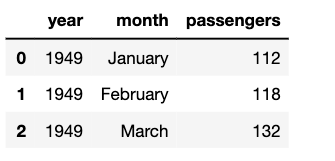
Let's load in some data using seaborn's handy load_dataset() function. The flights dataset has three variables: two ordered categorical (year, month) and one continuous (number of passengers).
Input:
flights = sns.load_dataset('flights')
flights.head(3)
Output:
A simple histogram will show the overall distribution of the passenger variable. This is easy to plot, as pandas dataframes have a built-in method for generating it.
Input:
import pandas as pd
import seaborn as sns
%matplotlib inline
Output:
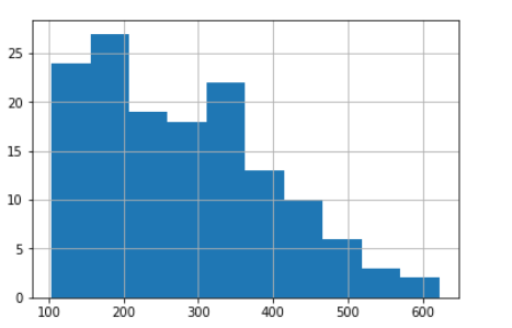
By default, pandas plots histograms using 10 bins but you could fine-tune this. Displaying more bins gives a more detailed overview of the distribution, up to a point: it all depends on how many observations you have overall and how they are distributed. You can see how using 20 bins shows more information about the distributions inside the larger 5 bins.
Input:
flights.passengers.hist(bins=5) # The blue bars
flights.passengers.hist(bins=20) # The orange bars
Output:
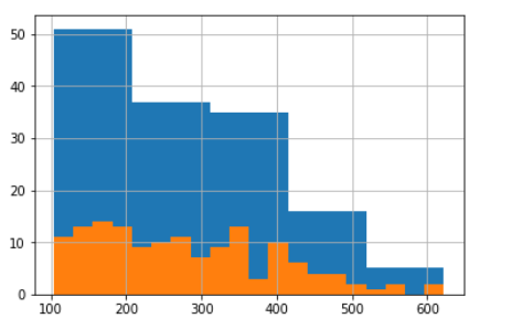
So the range of passenger numbers is a little over 100 to a bit over 600, with most flights towards the lower end. For a more precise overview, the describemethod for a dataframe's columns will give general descriptive statistics.
Input:
flights.passengers.describe()
Output:
count     144.000000
mean      280.298611
std       119.966317
min       104.000000
25%       180.000000
50%       265.500000
75%       360.500000
max       622.000000
Name: passengers, dtype: float64
Boxplot
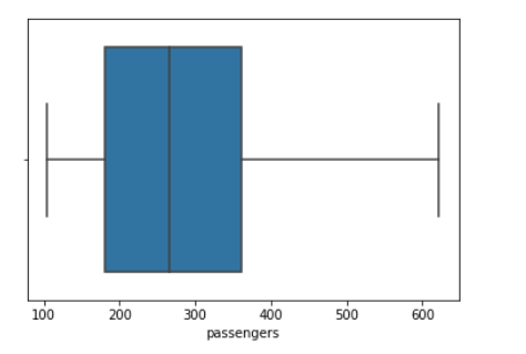
For a visual representation of describe, a boxplot will show the minimum and maximum values (the left and right whiskers), the range of values covered by the 25th to 75th percentiles (the box) and the value of the median (the line inside the box).
Input:
sns.boxplot(x=flights.passengers)
Output:
Single Variable: Categorical
Bar chart
When you have a variable which takes on named, rather than numerical, values then the most common way of representing them is with a bar chart.
Here, we'll load the titanic dataset. Each row is a passenger on the ship, while the class variable gives the class of that passenger's ticket.
titanic = sns.load_dataset('titanic')
titanic['class'].value_counts()
Output:
Third 491
First 216
Second 184
Name: class, dtype: int64
You can chain .plot(kind='bar') to the above value_counts() method, but I prefer to use seaborn as you can directly pass it the original data. It will then do the counting for you and allow you more control over appearance. For example, if you do not like the ordering seaborn used for the x axis, then you can set it manually as a list e.g. order=['Third', 'Second', 'First']
Input:
sns.countplot(titanic['class'])
Output:
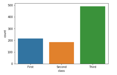
If you want to normalise the counts so as to see relative percentages rather than counts, then you just need to do that to the data before plotting it as a normal barplot.
Input:
titanic_normed = pd.DataFrame(titanic['class'].value_counts(normalize=True)).reset_index() sns.barplot(data=titanic_normed, x='index', y='class')
Output:

Plotting relationships between variables
Above, we only had a single variable. We examined it by looking at the frequency of values (the histogram) or by plotting descriptive statistics (the boxplot). But often we want to see how one variable is linked to another - as the value of one variable changes, what happens to the value of the other variable?
With continuous and ordered/unordered categorical variables, we have four possible combinations. Let's look at them in turn.
Continuous x continuous
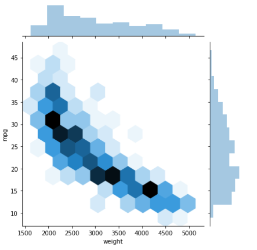
The mpg dataset contains information about cars, measuring their weight, fuel efficiency and so on. We might expect heavier cars to have lower fuel efficiency.
When plotting continuous variables, the one you place on the x-axis should be the independent variable. This is generally some property or value we observe. The y-axis should display the dependent variable. This is a function of the values on the x-axis and is generally something we measure for each observed value on the x-axis. Here, we will place weight on the x-axis and miles per gallon on the y-axis.
Generally, the best choice of visualisation for this is a scatterplot. Each point represents the relation between a single value on the x-axis and its corresponding y value.
Input:
mpg = sns.load_dataset('mpg')
g = sns.scatterplot(data=mpg, x='weight', y='mpg')
Output:
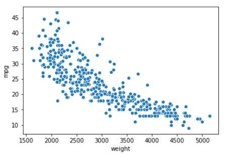
There are several variations on this, which are made available through seaborn's jointplot. The default will add histograms on the margins, for each of the two variables.
Input:
mpg.head(3)
Output:

Input:
sns.jointplot(data=mpg, x='weight', y='mpg')
Output:
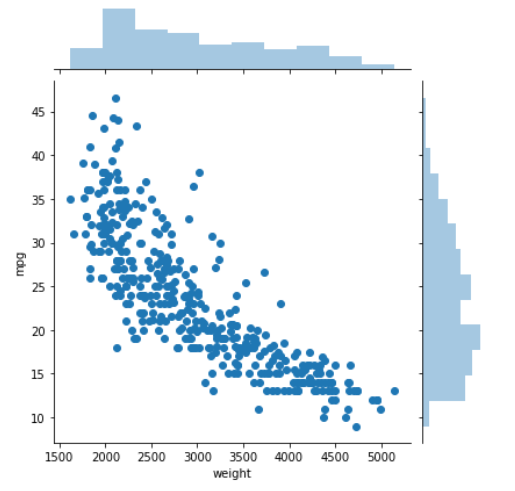
By setting the kind argument to kde, you can instead plot a joint kernel density estimate, with individual density estimates on the margins.
Input:
sns.jointplot(data=mpg, x='weight', y='mpg', kind='kde')
Output:
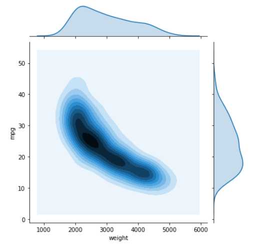
Or you can set it to hex and plot the values as hexagons, which represent histogram-type bins. This can be very useful if you have a lot of observations in your dataset and plotting all those points is slow or messy.
Input:
sns.jointplot(data=mpg, x='weight', y='mpg', kind='hex')
Output:
Continuous x unordered categorical
There are a few more options when it comes to jointly plotting continuous and categorical data. In general, the categorical data will go on the x-axis and you may need to change the order in which they are displayed.
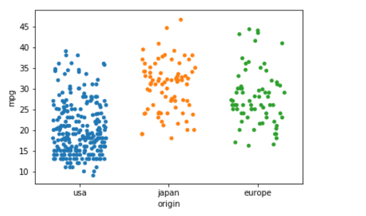
Let's look at the relationship between fuel efficiency (continuous) and a car's country of origin (unordered categorical). Seaborn's willstripplot make a separate scatterplot for each categorical variable and place it on the x axis, with its own colour. It will also stagger the points a little to help see their distribution - this can be controlled with the jitter argument.
Input:
sns.stripplot(data=mpg, x='origin', y='mpg', jitter=0.3)
Output:
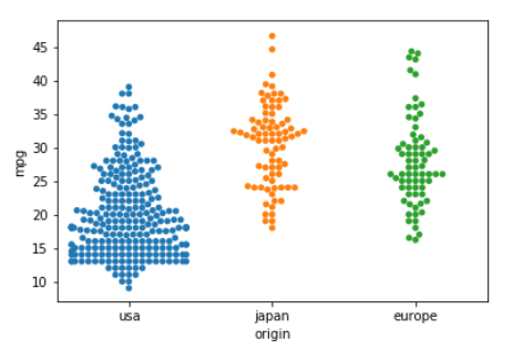
The swarmplot does the same but arranges the points so that there is no overlapping.
Input:
sns.swarmplot(data=mpg, x='origin', y='mpg')
Output:
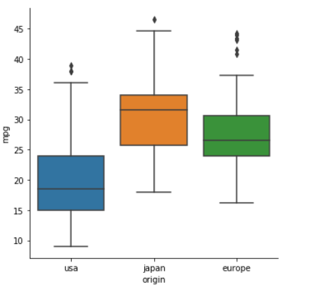
And if you want a boxplot for each categorical variable, there is no need to do them separately and manually place them in a figure - catplot is a great way to plot categorical x continuous data.
Input:
sns.catplot(data=mpg, x='origin', y='mpg', kind='box')
Output:
Continuous x ordered categorical
Sometimes, the categorical data will have a natural order to it. The most common of these is times or dates. This can sensibly be plotted as a line, to show how the continuous variable changes over time. Generally, the categorical data must be unique - no value should appear more than once.
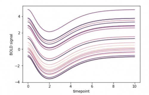
The gammas dataset contains fMRI measurements taken from multiple subjects. Let's look at subject 0, and see how a signal which is dependent on blood oxygen levels (BOLD signal) changed over time in various regions of interest (ROI) in the brain.
Seaborn's lineplot method has a hue argument, that will seperate out the three different values for ROI and plot them as their own lines.
Input:
gammas = sns.load_dataset('gammas')
subject_0_data = gammas[(gammas.subject == 0)]
sns.lineplot(data=subject_0_data, x='timepoint', y='BOLD signal', hue='ROI')
We could also focus on a particular ROI and then see how all subjects compare by setting hue="subject"
Input:
sns.lineplot(data=gammas[gammas.ROI == 'IPS'], x='timepoint', y='BOLD signal', hue='subject', legend=False)
# Remove the legend as it gets in the way with the default plot size.
Output:
Categorical x categorical
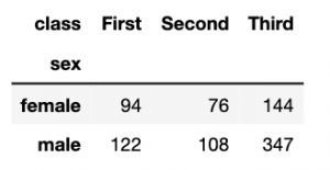
The most common non-graphical way of representing two joint categorical variables is as a contingency table. Each row of the table represents a possible value of one variable, the columns of the other variable. Cells are populated with the number of observations of pairs of those values.
We can create that table using pandas' crosstab function - just tell it which columns of a dataframe to use.
Input:
titanic = sns.load_dataset('titanic')
titanic.head(3)
sex_class = pd.crosstab(titanic.sex, titanic['class'])
sex_class
Output:
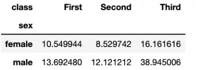
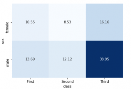
We can also normalise the values to show percentages, rather than counts.
Input:
sex_class_normed = pd.crosstab(titanic.sex, titanic['class'], normalize=True) * 100
sex_class_normed
Output:
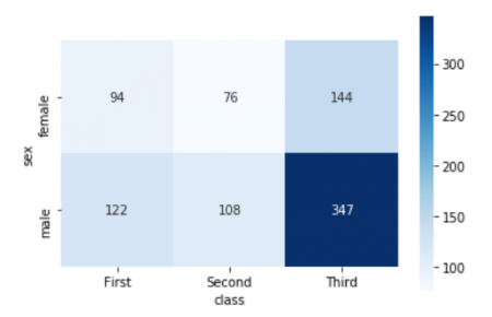
This tabular data is easily to represent visually as a heatmap. This essentially colours in the cells of the table, based on their value. It can be a great way to very quickly communicate the joint distribution of two categorical variables, especially where you want to highlight the fact that some particular combinations are very high or low.
Input:
sns.heatmap(sex_class, cmap='Blues', square=True, annot=True, fmt='g')
Output:
Input:
sns.heatmap(sex_class_normed, cmap='Blues', square=True, annot=True, fmt='.2f', cbar=False)
Output:
Summary
Questions to ask before plotting
Here are the questions to ask before you start plotting:
-
What is the purpose of my visualisation?
- Show the relationship between variables?
- Illustrate individual distributions of variables?
-
What kind of variables do I have? For each variable:
- Is it continuous?
- Or is it categorical?
-
Besides these variables, is there some other informative distinction I want to show? Do my variables come from...
- different groups of people/individuals/companies/locations?
- different time periods?
- different experiments?
- different models?
-
Have I included all the necessary information?
- Descriptive title?
- Informative caption?
- Axes have suitable labels?
- Units for axes, where appropriate?
- Axes using suitable scale?
- Do I need a legend?
- Do my colours and styling aid readability?
Cheat sheet: picking a visualisation for your data
And a quick list, linking types of data to types of visualisation:
Single variable
- continuous
- histogram: more visual, big picture, show distribution of ranges of values
- boxplot: more statistical and detailed
- categorical
- barchart: show counts or proportions of values
Joint variables
-
continuous x continuous
- scatterplot: show relation between every x and y
- basic jointplot: as above, but with marginal histograms per variable
- kde jointplot: show distribution of joint values, with individual histograms
- hex jointplot: as above, but points are now mini-histograms
-
continuous x unordered categorical
- stripplot: multiple scatterplots arranged on x axis
- swarmplot: as above, but no overlapping points allowed
- catplot with boxplots: replace individual plots with boxplots
- continuous x ordered categorical
- line: shows exactly what values are seen over time
- categorical x categorical
- cross-tabulate then heatmap: show relative proportions of joint variables
Next steps
-
Look into seaborn's documentation for figure aesthetics and choosing colour palettes - these can make your visualisations look really great. The ones I did here use the default settings and could definitely be improved upon!
-
Think about how the plots could be improved in terms of the questions under "Have I included all the necessary information?". Seaborn makes it very easy to add titles and so on to figures.
-
Seaborn also makes it easy to visualise many aspects of the data at once, rather than individually as we did here. Read the documentation for jointplot and catplot to see how flexible and easy to use these methods are!
-
Try applying the above to real data that you have, rather than the toy datasets used here.

About the author
Alexander Robertson is a Data Science PhD student at the University of Edinburgh, where his research focuses on variation, usage and change in natural language and also emoji.


